<\/HEAD>
New in our content offering are the incidents from the Nationale Databank Wegverkeersgegevens (NDW), a joint initiative by and for participating road authorities. The NDW keeps track of various traffic-related data. This service contains information about the location and nature of incidents on Dutch roads. These include, for example, accidents, broken-down vehicles, collisions, and various obstructions such as recovery operations. We offer the data via two feature services; one with current incidents<\/A> and an archive with historical incidents<\/A> from (end of May 2019). Both services are near real time, with data updated every minute. The advantage of feature services is that analyses can be performed directly on them in both ArcGIS Pro and ArcGIS Online without having to download the data locally first. These services can be viewed in the webmap<\/A>, which contains a fully formatted pop-up. In addition to the webmap, we also offer a dashboard<\/A> in which the data is displayed in various ways. It is possible here, for example, to view the number of incidents per type over time.<\/P> <\/P>
This blog was written by
Maud Soetens<\/A> and Jeske van der Velden<\/A>, both active in the content team of Esri Nederland. <\/EM><\/P> <\/P>
When creating the new webmap and dashboard, we used a number of new possibilities of the ArcGIS platform such as designing base maps and the scripting language Arcade. We would therefore like to share with you how these new NDW items came about.<\/P>
<\/P>
The design of the webmap<\/STRONG><\/P> <\/P>After publishing the two services, we started working on the
webmap<\/A>.<\/P><\/P>
 <\/P>
<\/P>
First of all, it is important to determine who the target audience is and what is the purpose of the webmap? The target audience is anyone interested, from residents to analysts. Therefore, it is important that the webmap is clear. The purpose of the webmap is to clearly see at a glance what kind of incidents are currently on the roads in our country. To achieve this, we chose to create symbols to visualize the data. By designing these symbols differently per incident type, it is easy to immediately distinguish between different incidents, such as an accident or a broken-down vehicle. The current service is displayed with these symbols, but the historical data is symbolized with firefly symbols. This choice was made to keep the map more readable. Firefly thus provided a nice solution. See this
page<\/A> for other visualization options with firefly.<\/P> <\/P>
Designing a unique base map<\/STRONG><\/P> <\/P>The second step in creating the webmap is designing the base map. The base map is different from the standard base maps in our content offering. This is because this base map has been customized with the new Vector Style Editor, which is now integrated into ArcGIS Online. This makes it possible to design base maps directly within Map Viewer in ArcGIS Online. It is only possible to customize vector base maps because they are built from vectors that allow you to adjust the styling of the map as you wish. This can be done by clicking on the Symbology icon under base map:<\/P> <\/P>The style must first be saved before starting editing. <\/P><\/P>To better highlight the data, we thought it was a good idea to only highlight roads and keep the rest of the map calm. This way, attention focuses only on roads, which is better for visualizing incidents on roads. For each part of the base map there are options to set custom colors, scale levels, and transparency among others. To make roads stand out well, we needed a base map with a calm background. The Topo RD Vector Light Gray proved suitable for this. We chose to adjust the color of regional roads, main roads, and highways. This was done by going to the correct data of the base map, in this case infrastructure > road segment line<\/EM>, and selecting a color per road type.<\/P>
 <\/P> <\/P>We left local roads gray because otherwise the map became too busy. Moreover, the services only contain incidents on A, N and E roads so highlighting local roads was not necessary. Additionally, we gave regional roads a different line thickness making the map look even calmer. In short, many nice possibilities! There are endless ways to unleash your creativity on these Vector Style base maps. Read all about it in this
blog<\\/SPAN>.<\\/P><\\p> <\\p>Creating pop-ups with Arcade<\\/STRONG>
Arcade is a powerful way to format pop-ups. Our colleague Ellen van den Berg has used Arcade to enliven the Hectometer points popup and we also used Arcade for pop-ups in this webmap. We would like to explain how we designed this for the NDW incident service.
First we created a design for how we wanted the pop-up to look. The idea was to display the background as a road with information on the lanes. When formatting the pop-up we chose A custom attribute display and then selected HTML mode. With HTML we created a table where we adjusted color, width and height of fields so that a road was represented.
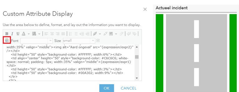
To avoid overcrowding the pop-up we chose three pieces of information: nature of accident, date and time and location of accident. On left lane we wanted to show symbols for this, on right lane actual information in text.
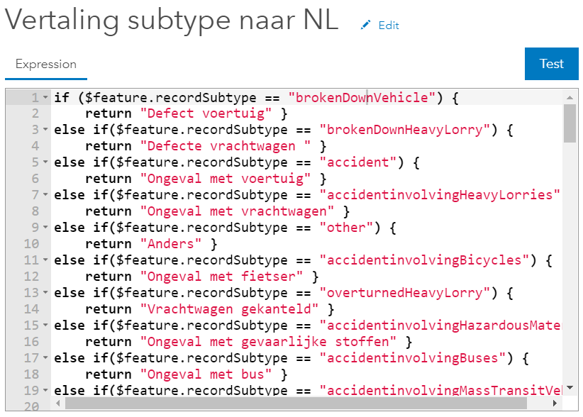
The nature of accident is already included as an attribute in dataset but it is in English. With Arcade we translated this into Dutch. For this we had to start a new expression in pop-up screen. Then we used a simple else – if construction.
If ($feature.recordSubtype == "brokenDownVehicle") return "Defect voertuig" basically means:
If a feature has attribute recordSubtype "brokenDownVehicle", then return "Defect voertuig". We translated all possible attributes into Dutch this way. Such result could also have been achieved by setting domains.
The icons we wanted to display vary per nature of accident. For an overturned truck we wanted a different icon than for a collision. First we uploaded all icons to ArcGIS Online. This can easily be done by going to Content then choosing Add Item > From My Computer. Note that images must be publicly shared to be displayed in pop-up. Now all icons have their own URL found at bottom right on Item page. With this URL we applied similar code as used above but here result was not Dutch translation but an image corresponding to nature of accident.
<\/P>
So now we have two Arcade expressions. In the pop-up, the result of such an expression can be called with {expression\/expr<\/SPAN>[number]}<\/SPAN>. The only thing left for us here was to paste this into the correct field in the HTML code. The result was that the first line of our pop-up was ready:<\/P><\/P> <\/P><\/P>The second line, date and time, was easier to realize. The icon for this is a clock that would remain the same regardless of the attribute. We also uploaded this icon to ArcGIS Online, but instead of using an Arcade expression, we could use this link directly in the correct field in our HTML code.<\/P>
  <\/P>The date and time are already included as an attribute in the dataset. Therefore, in the HTML code, we only had to refer to the attribute named recordCreationTime<\/EM> by using {recordCreationTime}<\/SPAN>.<\/P>
  <\/P>This made the second line in our pop-up complete as well.<\/P> <\/P>The icon for the location worked the same as the clock: this is also a standard icon uploaded to ArcGIS Online and directly referenced in the HTML code.<\/P> <\/P>The biggest challenge was displaying the location, since apart from the coordinates no location information is given in the NDW dataset. This information therefore had to be retrieved from another dataset. For this, we added the NWB road sections to the webmap. These are lines containing the name of the road and the municipality where the road section is located. We wanted the location of the accident to be linked to a road section so that we could extract the name of the road and municipality. Just like with geoprocessing tools in ArcMap or ArcGIS Pro, Arcade is also capable of performing Intersection <\/A>. Unfortunately, for an intersect with Arcade a polygon layer is needed and we had a line file (NWB) and a point file (incidents). Fortunately, this was quickly solved with a buffer. Buffering can also be done with Arcade without having to create a new dataset with geoprocessing tools. So first we created a buffer around the incidents and then performed an intersect with the NWB road sections. From the road section where an overlap was detected, the name of the road (STT_NAAM) and name of the municipality (GME_NAAM) were returned. This result was again applied in the HTML code. This is the Arcade expression we used:<\/P>
 <\/P>
var buff = Buffer($feature,1,'meter')<\/SPAN><\/P>var intersectLayer = Intersects(FeatureSetByName($map,"NWB - wegvakken"), buff)<\/SPAN><\/P> <\/SPAN><\/P>for (var f in intersectLayer){<\/SPAN><\/P> return f.STT_NAAM + ", " + f.GME_NAAM<\/SPAN><\/P>}<\/SPAN><\/P><\/P>And this is the final result of the pop-up:<\/P>  <\/P><\/P>Now that our webmap is ready, we can use it as a basis for a dashboard.<\/P> <\/P>The NDW dashboard<\/STRONG><\/P> <\/P>To present the data well and convey most information, we created a
dashboard<\/A>.<\/P> <\/P>
 <\/P>
<\/P>
<\/P>
This was made with
Operations Dashboard for ArcGIS<\/A>. Operations Dashboard is a configurable web application that can be customized with interactive dashboard functions as desired. We used several different functions, namely indicator<\/EM>, list<\/EM>, and serial chart<\.EM>.<\.EM>.<\.EM>.<\.EM>.<\.EM>.<\.EM>. <\.EM>. <\.EM>. <\.EM>. <\.EM>. <\.EM>. <\.EM>. <\.EM>. <\.EM>. <\.EM>. <\.EM>. <\.EM>. <\.EM>. <\.EM>. <\.EM>. <\.EM>. <\.EM>. <\.EM>. <\.EM>. <\.EM>. <\.EM>. <\.EM>. <\.EM>. <\.EM>. . . . . . . . . . . . . . . . . . . . . . . . . . . . . . . . . . . . ...
